WoW.com did a little post comparing the Alliance to the Horde Shaman tier 9 pieces, I’m sure you’ve seen it by now, if not it’s worth the read.
The tier 9 stats are good so far, but I really think they dropped the ball on looks. Lets take a quick peak at them
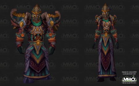
Alliance:

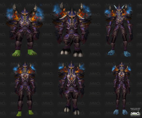
Horde:

Just look at them, it’s nothing to write home about. The alliance one though just makes me very sad. If you go back to my old post Why Play a Shaman? I posted a picture of a bunch of the tier sets up to Tier 7, add in Tier 8 and we’ve had a hell of a good run with some nice looking gear. (with in my opinion one exception, but more on that in a second). I was excited for the new tier set and was interested to see how they would do the faction specific gear. Let me share my opinion with you.
Alliance Set
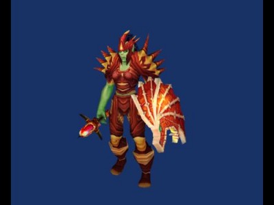
I’ll be honest. I don’t like it. I’m kind of ok with the helm, but the rest is just…. blah! Looking at the set it reminds me of another odd set we had back in the day, the Stormcaller’s Garb (also known as Tier 2.5).
Here’s a picture of it:

In a time where Tier 2 and Tier 3 sets were around, this set just seemed out of place. Thats how I feel with Nobundo’s set for alliance. The set lacks anything distinctly “Shaman”, honestly to me it feels more like a Druid set look-wise.
Where is the power of the elements? Tier 1, 2, 3, 5, 6, 7 and 8 all have very obvious signs of elemental power coursing through it. Tier 4 was a little subtle with its touches of elemental power but it was still there (the water orb effect of the shoulders). So you have Stormcaller’s Garb and Nobundo’s gear which both lack anything that is distinctly “Shaman”. Give me lightning or caged fire! Something! Anything that says “The spirits of the elements flow through me”! The color scheme as well is something that is lacking. Teal, orange and Purples? blech! Give me a color scheme that makes sense! Also, my faction symbol is a lion’s head roaring, why not make it more prevalent then two small icons on the shoulders?
Horde Set
Horde fared much better then alliance here. Very clear Elemental influence, Color scheme is solid with Blues and Reds worked into the metal coloring. Faction symbol dead center on chest (just like the old Tier 2 set!). The set might be very similar to the Cataclysm Set (Tier 5) but I’ll forgive them that because it looks pretty cool still. My only gripe is it doesn’t seem horde enough. Now I’m sure I’ll get flamed for saying this, but to me the height of Shaman gear was Tier 2. That set was amazing, particularly going to talk about the shoulders. Carved Wolf faces with lightning crackling over them? Not only did that scream shaman it screamed Horde (at least to me) I would have liked to have seen some animalistic reference in there. All in all though, much better then the alliance set.
I think this was an ok effort, but I find myself lacking any motivation to wear the pieces. Sure I’ll get them and use them during raids, but I think I might have to resurrect a “vanity” set for general use when not raiding.
How about you? What do you think of the sets? What do you like or don’t like about them? What would you like to see?
Until next time,

Images courtesy of mmo-champion
Yea, a ball was definitely dropped on T9 armor. But then, I feel like they’ve been dropping it for a while now. T4 looked fantastic for Alliance, and T2 really is the pinnacle of Shaman gear for Horde, but everything else has been rather lackluster.
T9 is just ridiculous though.
Tier 5 is still the best. The flames and lava inside the cracks in the armor make T5 stand out. Probably the best among all of the other T5 as well.
@ deibukun I loved how it had matching fist weapons too! That made the set killer as well.
oh man 🙁 I know I’m a bad shammy for operating this way, but I swear i wore my t7 pants, even though I had t8 already, until I was able to get t8 chest, because I feel like shammies should be wearing kilts. now I have to wear pants again? its not horrible looking set, but..
and t5 WAS an awesome looking set, though I have to say I liked t6 almost as much.
I actually really like the Tier 9 Horde. It hearkens back to my favorite Shammy set (Tier 1) with the lava shoulders. To this day, the shoulders from Molten Core are still my favorite armor in the game. I think the T9 Horde does a good job of capturing that.
The Alliance set, you’re right, is kind of meh. It looks like a Druid, which kind of makes me laugh, because in classic, I would always complain that the Shaman was the Druid’s Hero class (before we knew what hero classes were and when Innervate and Hurricane were still 31 point talents).
Though as a set, I think Shaman Tier 6 was the best looking. It had the most cohesion aesthetically.
.-= Beej´s last blog ..Just Call Me Griefer Sutherland =-.
If a ballerina tutu has good stats, I’ll get the pink slippers for the set bonus :p
The t9 alliance looks kind of India / South Asian looking. Though that lense it looks pretty neat, but more like ceremonial guard armor than anything else.
I’m not very aesthetically picky to be honest. But I agree that this gear could hardly be consider visually epic.
The Alliance tier gear here looks….. Fishlike in my opinion, or fish meets ninja, or some odd deformed thing that shouldn’t exist. my current priest set (tier 7 ir 8 i really don’t follow it well) SCREAMS priest, i mean cmon I get wings and a HALO for crying out loud.
Its obvious that someone put a lot of work into the alliance T9 shaman set. Unfortunately this person is color blind and hates Draenei.
I would of thought a alliance specific shaman set would have a recognizable Draenei influence. Or even better an armor set that somehow is influenced by the Broken.
I prefer the Alliance set to the Horde set but neither is very good to be honest. Blizzard usually comes up trumps with high tier armor designs but these ones seem a little shoddy.
.-= We Fly Spitfires – MMORPG Blog´s last blog ..Extreme Makeover: Website Edition =-.
Paladins would like to extend a warm welcome to the Alliance Shamans for joining us in the Raid in Dresses club.
.-= Honorshammer´s last blog ..An About Page? =-.
I’m sure you saw the hundreds of pages of complaints about T9 art. No one likes it for any class. The whole horde v. alliance thing, with armor classes the same, might have worked out if the art had been detailed. In fact, I’m sure we would have worn “uniforms”–literally every player in the argent army the same–with glee had they been absolutely beautiful and detailed.
It’s my feeling that they’ve been tweaked a bit since the first reveal to have a few more textures, but on the whole it looks worse than, say, the outland dungeon set. That’s just wrong! Everyone is a bucket head.
I don’t know why mages complain about dresses. I am a Holy pally, and I love my dresses.
I would also like to extend a warm welcome to yet another class for whom the best looking tier was tier 2, also a dress set, and the slightly less popular purple judgment nonset from BC dungeons. I still want to farm that up for walking around in the cities.
1. It is purple
2. It is a dress
Therefore it rocks.
.-= Arkaneena´s last blog ..Tanking as a healer =-.
Horde T9 isn’t too bad; it has nostalgic flavor to it, appearing to be the lovechild of the Warlord level 60 PVP set and T1. It isn’t my favorite shaman set, but it’s still decent looking. For our alliance counterparts…bleh, that set looks like a slight remodel of the current PVP sets with an AQ gear paint job.
These sets are the first where Blizz “dropped the ball” with the set’s artwork, although I personally don’t mind the Horde T9.
.-= Kazgrel´s last blog ..The Joy…er Pain of Pugging =-.
I love the shaman gear, i think it looks amazing and brings back some of the vanilla flair, that shamans had before. This is like an amped version of Tier 1, which is great imo
Hm… IMO, the designers did a really good job on the ally set. It looks really fluid, kind of resto, not really elemental, but still harmonic. A strange decision to go with the typical bucket-head helmet, but it’s their call…
Now, the horde version is just not finished. Shoulder tops are in the middle of nowhere – sideways is balanced, center is balanced, in between doesn’t cut. The helmet is dull, bottom part of the shoulders should be extended lower so that it looks finished on all races, different colored details are centered on the upper part of the torso, legs kind of fade away… Nah… as far as my arty opinion is concerned, they could’ve done it better. 🙂
Tier 9 is awesome looking. Why must every armor set look elemental, or influenced by the elements?
If they follow that design theme you’ll run out of elemental armor pretty quickly, or get plenty of players who want something different.
Why doesn’t any of the horde’s have shoes? O; looks stupid.
honestly to me that set of gear looks pieces of bacon and meat wrapped all together and the sheild is a huge rack of ribs. tasty but no class. mmmmmm…. bacon