Spoiler warning (As if the title didn’t give it away)
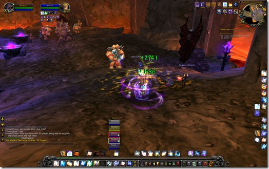
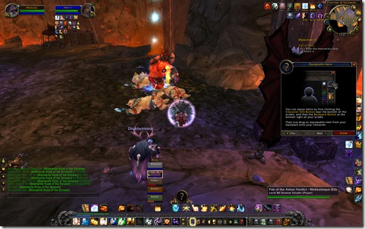
Check out the updated default healing UI. Yes, this is the default UI. As in, the interface you get without any customization whatsoever. I queued randomly into Blackrock Caverns (took a while, but I managed to get in).
What you see right now is actually the raid frames, not the party frames. I didn’t switch to party frames yet (I prefer my raid UI for everything and this is as close as I can get to it). First thing you’ll see is that the top left of each player has a little role icon.
Never again will I ever see the question “Who are the tanks?”
At least, I hope.
And yes, the red frame highlight shows who currently has aggro.
Yellow frame shows who I currently have selected. You can also move the frames around. I haven’t found out how to lock it in place yet.
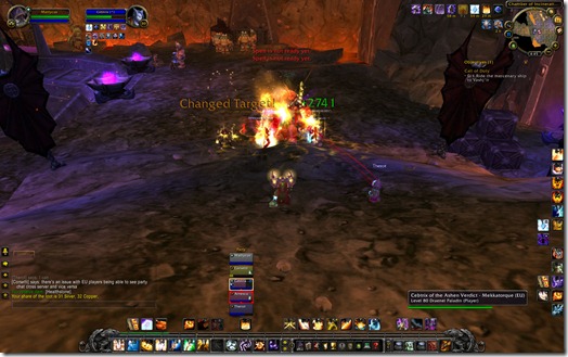
Now we’ve got some more action going on here. The healing combat text hasn’t changed much. My personal Renews appear on the bottom right. Haven’t shielded anyone yet.
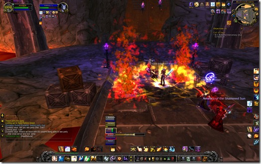
If you look carefully at our tank, you can see a Frostbolt icon on the bottom left. I almost missed it. Things like debuffs that can be removed need to be made a lot more noticeable.
Green bar shows approximate incoming heal amount. I don’t know if that’s before or after any type of Mortal Strike debuffs or healing buffs.
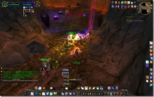
That’s it for shots since I’m too busy trying to keep the group alive (Prayer of Healing was the next spell cast, believe me).
Then we wipe because I cast Guardian Spirit on the wrong Pally when some Ogres and stuff wander into us.
EDIT – Back in. Here’s more:
Something that needs to improve on is the dispelling interface. It’s really hard to notice. You have to mouse over it in order to see what type of debuff it is. In the shot below, you can see a little red skull icon on the top right denoting a disease. The actual disease icon is then on the bottom left where you can mouse over and see what it actually is.
I think a better solution would be to fill the entire player frame with the appropriate dispel color which states what type of debuff it is.
For example, if I get hit with a Frostbolt, my background color could fill with a gradient blue which overrides my normal class color of white. That would make it extremely obvious I have a debuff. The actual debuff icon could still be on the bottom left.
Definitely very cool though.
Thoughts? If this continues to get developed and streamlined further, I might not have to use custom raid frames anymore.
