As healers, we are all unified by our singular dedication to our craft: Restoring life. But this is where our similarities end. Some of us like to click. Others rely on keys. Players prefer being overloaded with information. Minimalists prefer more “white spaceâ€Â.
From Plusheal, I’ve gathered a collection of diverse raiding UIs that healers had to offer. For those of you looking to simplify or expand your healing UI somewhat, maybe this will help spark some inspiration.
Grid healers
Evissadia – Holy Priest
Gerunna – Resto Shaman
Kallisti – Holy Paladin
Crutches – Holy Paladin
Evilhalo – Holy Priest
Tulani – Holy Priest
Ayslin – Holy Priest
Healson – Holy Priest
Lightpelt – Resto Druid
Kuraj – Discipline Priest
Myna – Resto Druid
Lilitharien – Discipline Priest
Minischoles – Resto Druid
Reviamjolly – Discipline Priest
Tequiladin – Resto Druid
Englar – Holy Priest
Other UI healers
Sacrales – Holy Paladin
Avonar – Holy Priest
Dallarus – Resto Druid
Nattydread – Holy Priest
Rainomi – Holy Paladin
Revaan – Holy Paladin
Rostam – Holy Priest
Shadowjoker – Holy Priest
Sinea – Priest
Arilyn – Holy Priest (How many raid frames do you NEED?!)
Asadachi – Holy Paladin
Beneficience – Holy Priest
Brique – Holy Paladin
Cathe – Holy Paladin
Daedhir – Discipline Priest
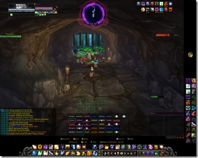
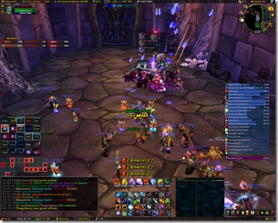
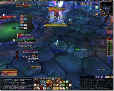
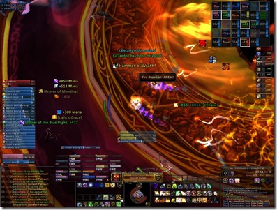
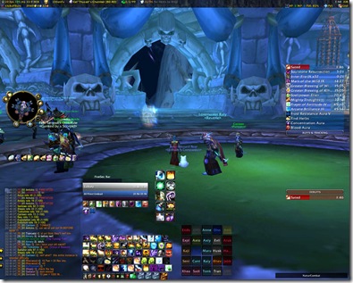
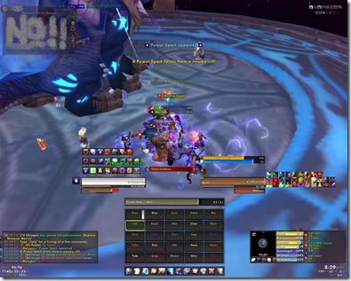
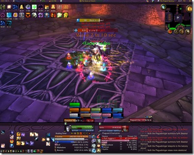
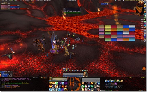
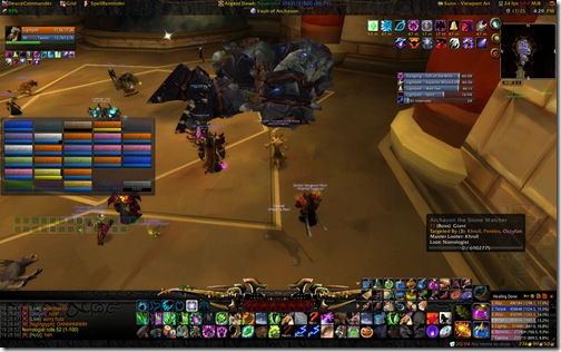
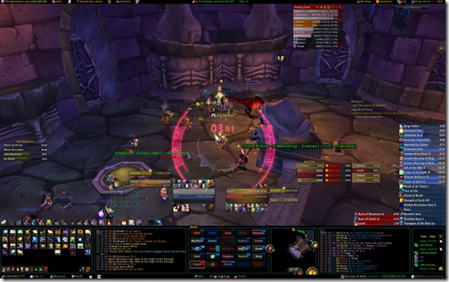
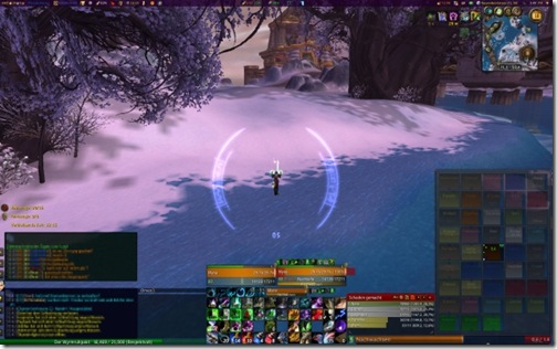
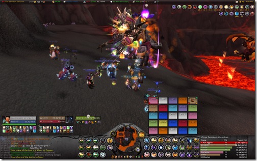
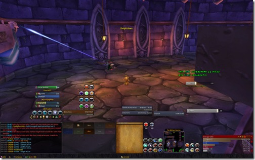
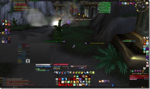
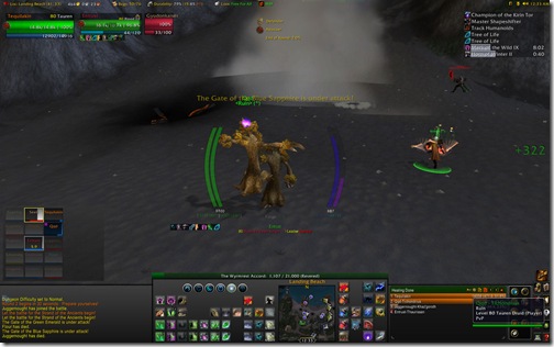
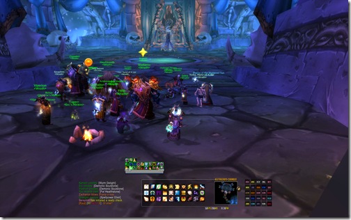
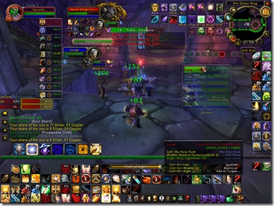
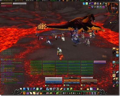
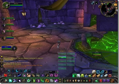
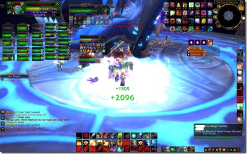
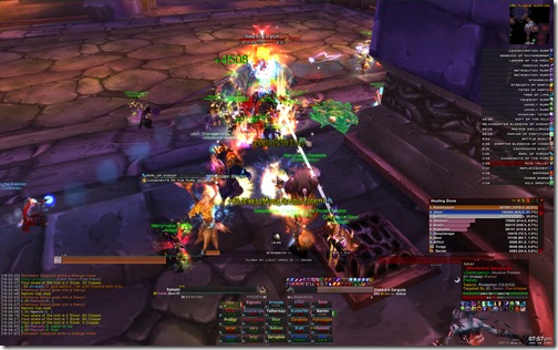
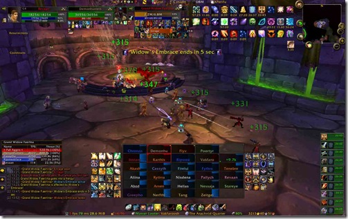
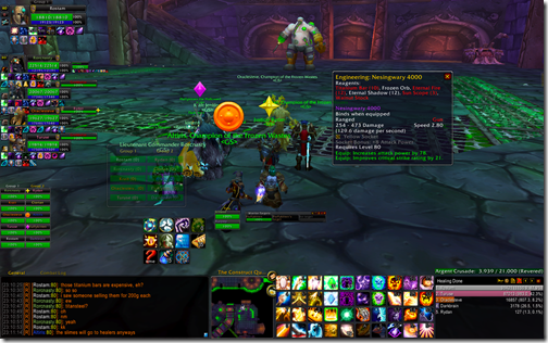
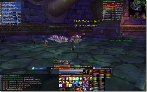
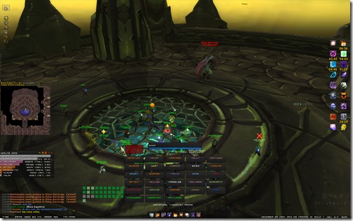
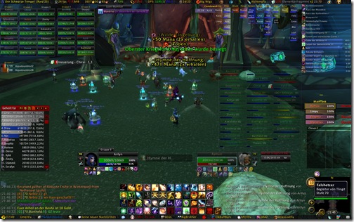
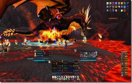
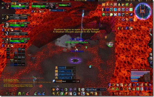
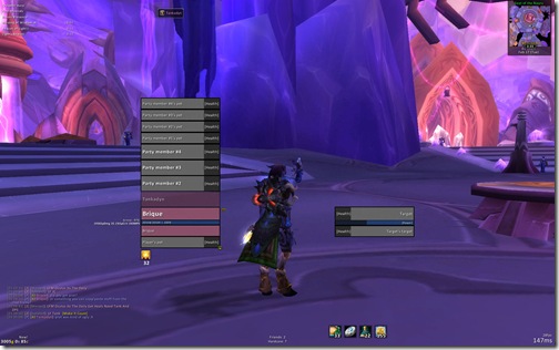
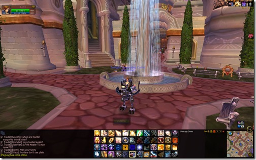
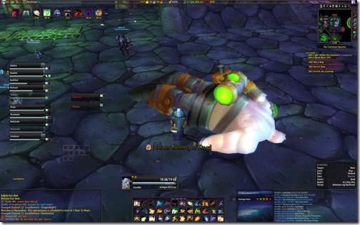
(Englar – Holy Priest) Definitely has the cleanest UI, leaves a lot of viewing. I like it
Nice list of screens, and i know both Grid and Healbot are excellent(for priests and paladins), but for druids there is one addon that is far supperior then those your showing.
After searching all my addon sources i came across Rewatch, which at first glance looked so so. But after running 10/25 Naxx i’m completely sold. It is excellent for keeping track of all your hots!
http://wow.curse.com/downloads/wow-addons/details/rewatch.aspx
/Hemlig of Tarren Mill
Englar wins this one for sure.
Hemlig, you should set up Grid better. With GridSatusLifebloom and GridstatusHoTs (on WoWAce) you can see the duration on your hots for everyone in the raid, without having to look at a set of bars that move at a different speed, which is a horrible way to accurately parse information. I have three corner icons set up for Rejuv, Regrowth and Wild Growth, with center text two showing the stack size, and remaining time on lifebloom in tenths of seconds.
Personally, I always struggle to make my UI both clean and useable in PvE and PvP. The informational requirements for the two are so different it’s hard to unite both in one UI, but I love tinkering with it, so it’s all good. 😀
I actually spent many hours going through the UIs in that Plus Heal topic and got a lot of ideas. Using those ideas I designed my own UI on paper and then constructed it on screen.
Where’d all the healing shammies go ><
Well, yes, way too many raidframes 🙁
Actual UI is somewhat better, but no way to get rid of Healbot and SmartDebuff. Does someone use Pitbull and Clique?
(http://trolling-stone.de/uploads/Raidui.jpg)
Hate to be a nuisance but I think some of the healbot screens are using a different frame as mentioned:
– nattydread: X-Perl
– rainomi: ?
– revaan: Grid
– shadowjoker: Grid
– sinea: not sure but could be Grid or Pitbull
– asadachi: Grid
– beneficence: Grid
– brique: PitBull
– daedhir: PitBull
Nice collection of screens though. I’m always amazed to see so many differences between the UI’s. It puzzles me to see how different people see their preferences.
Of course.. none are better than my own 😉
Nice screenies all of them… but what about Smart DeBuff healers?
http://marriedirl.com/images/mar09/SB.jpg
*trots off to find the topic in Plusheal*
Holy hell! That is my UI! I feel all famous and stuff. I am flattered that you used it. 🙂
I am also excited that my UI was used. I am far too easily amused I think! 🙂
I think a lot of people underestimate mouseover macros. On my priest I just use x-perl for raidframes, and then mouseover macros for all healing & dispelling spells. You can get pretty elaborate with them, where it heals the mouseover target if friendly, or targetoftarget if the mouseover target is hostile, or if no target selected it heals your current target if friendly, or targetoftarget of hostile. If you have keybindings for your heals to macros like that, you can also have keybindings to the same spells but non-macroed, and leave your tank selected, so you can be raidhealing and leave your mouse over the grid, but heal the tank as needed without reclicking or moving your mouse.
Bah, you posted my old screenshot. 😛
New one here: http://tinyurl.com/bsxewd
Erica/Lilithariens last blog post.._erica: @mattycus And, actually, that’s the older version of my UI. 😛 New one here: http://tinyurl.com/bsxewd
Can we find out what mods Englar is using? I’ve never seen anything like that before. I try to keep my UI as minimal as possible.
I was just curious as to what the arcs are around the characters Kuraj and Myna? I have iceHud and that is not one of the options, but I like those a lot better if that is actually a Hud.
Zusterke: Thanks! I forgot to include a “Healing Frames – Other” because not everyone below Healbot was using Healbot.
Daria: Englar’s using a combination of Grid, Pitbull and Buttonfacade with Elegance Dark as his skin. Check this thread and do a Ctrl + F for Englar’s post: http://www.plusheal.com/viewtopic.php?f=10&t=994&st=0&sk=t&sd=a&start=60
Hey Matticus! Long time no see. Love this post. Would be great to get a run down of less obvious addons used, i.e not grid 🙂
Samownall – WoW Blog
samownalls last blog post..Arena Points Reminder for WOTLK
@ JGP: That’s powerauras. It’s great for watching procs and buffs/debuffs. Does require a bit of setting up though. 🙂
http://www.wowinterface.com/downloads/info8579-PowerAurasClassic.html
I am so glad mine was NOT used…..Chaos in motion.
Thank you Tarqon and JGP for answering my own query :p
I am so envious of people who have a screen large enough to contain all these addons. I never got the hang of grid, I find it takes time to get used to and I didn’t like having to adapt to a new addon during raid.
Englar’s UI is absolutely fantanstic!
While I’ve always tried to keep my UI as stock as possible (I dread getting used to them and not having them after patches), I’m going to give a custom UI another shot after seeing it. Thanks for this very informative post!
PS – Arilyn’s UI is pretty funny.
Any idea what Kuraj was using on the bottom part of his UI?
My experience in Wrath is that you spend hours perfecting your beautiful UI … and then you have to fight Malygos third phase or the last boss in Oculus. My UI is healbot with custom mouseover macros linked to keys (which I like much better than using the mouse to control all healing). It works great until I get to these vehicle-based fights and then i am scrambling to reconfigure pitbull to show drake health for all party members.
Anyone else have a good work-around for that issue?
What is erica’s (lilltharion) setup made of? I really like it, thank you!
ah, mine has changed a bit since then >.< not many changes, just the eepannels is set up a lot lighter at the top and i set xperl up with the default black and grey and set the bars to glamorous1 i think.
@ Brosephone: There’s a number of addons tha can achieve that effect, but if I had to venture a guess I’d say it’s KGpanels.
http://wow.curse.com/downloads/wow-addons/details/kg-panels.aspx
@ Lalande, wait for the Healbot author to add vehicle support or switch to different raidframes basically. As long as people are fast enough in shielding and moving Malygos is healable by just spamming the HoT and AoE heal on yourself though.
@ Solange: Looks like Pitbull, Grid, Bartender/Dominos and a buff mod skinned with Buttonfacade, along with Spartan UI (which is the artwork you see on the bottom). http://www.spartanui.com/forum/
What I find confusing is that none of these ui’s actually got pet’s enabled for grid.
Many classes (mainly hunters and warlocks) are quite dependant on their pets also receiving heals.
I aswell would REALLY like to know what UI addon erica’s (lilltharion) is using.
I googled some and found http://www.plusheal.com/viewtopic.php?f=16&t=994&start=60 with a list, but the lay-out doesn’t seem linked. (addon which forms the lay-out for the bottom half of her screen.
Please, any tips would be welcome. I simply love the UI.
@Silverbear:
That’s actually one change I’ve made to my Grid setup since I submitted my screenshot. Admittedly the main reason for doing it was for healing Malygos phase 3 once Grid figured out how to display the drakes as pets. I’ve kept that layout ever since as I’ve found that pets often make convenient targets for bouncing chain heals into the melee group.
@ Totemhugger: It’s SpartanUI, http://www.spartanui.com.
Thanks Tarqon, been looking all afternoon for it 😀
Going to try it out now. Also for the pets, seeing I am a shaman, they get healed by me chainheal, but I am not going to focus on them. They only bring 25-30% dps of someone and well, if they are dieing, it is the hunter/warlocks’ responsibility. If the hunter/warlock dies, the raid will lose the full 100%. So for having petbar on Grid is a waste of room (my 2 cents).
Phase 3 malygos I usually have default Bliz bars ready, only exception I make for it really.
Hey guys, I’m actually NOT using SpartanUI, so stop linking it!
All I did was swipe the art from it, none of my addons have anything to do with SpartanUI whatsoever.
Erica/Lilithariens last blog post.._erica: @mattycus I love weddings. Go, wish them luck, eat, drink, party, go home!
Sweeet, mine got featured 🙂
i love some of the great layouts here, particularly some of the more efficient ones, which give enough information, and plenty of viewspace, without being too minimalist:
my top pics are:
Myna, Daedhir and Asadachi
which in some ways remind me of my past UIs
I’m working on a minimalist version of my UI for 3.1 at the moment, and I’m making good progress. I’ve also started using Grid (still without clique, I’ll always love my hotkeys) so it’s getting pared down quite a bit. More screen real estate is never a bad thing.
If you can’t tell, though, I’m a sucker for a consistent look. I’m sticking with the charcoal gray bars and stuff, even for Grid. I think it’s going to turn out to be pretty cool. 🙂
Also, thanks for including my UI, Matticus. It’s always a work in progress, but UI design is one of the more fun things for me in game.
Zusterke, thanks for correcting Matticus’ post re: some of the UI’s including my own (Nattydred on the Malygos fight UI screen shot) as being mislabeled as healbot.
Xperl is a nice clean mod for showing buffs, debuffs and health and mana. Lots of options to customize it, and relatively easy to use for someone newer to mods.
After seeing my UI next to some of the others, I decided to redo mine, AGAIN!
http://files1.guildlaunch.net/guild/library/gallery/10476/wowscrnshot_030809_0138302044.jpg
@Silverbear – mine is showing a pet. I believe it’s one of the pets that couldn’t receive fortitude, that’s why it’s also showin gup pink.
Avonars last blog post..Tagged!
Does anyone know, what addon Lilitharien used there to display the buffs? (not that screenshot posted in the comments 😉 )
I really love everything but the “new” ElkBuffBars of that UI!
nice compilation! thanks!
It’s no wonder players keep dying in the flames, they got so much crap covering their screens, they don’t know what’s going on! Keep it simple stupid, a grid layout combined with a series of macros and keybindings is all you need.