Spoiler warning (As if the title didn’t give it away)
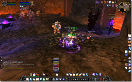
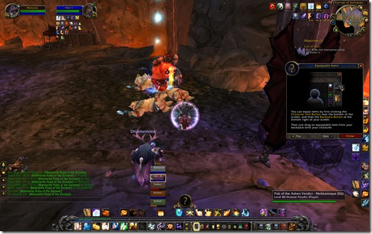
Check out the updated default healing UI. Yes, this is the default UI. As in, the interface you get without any customization whatsoever. I queued randomly into Blackrock Caverns (took a while, but I managed to get in).
What you see right now is actually the raid frames, not the party frames. I didn’t switch to party frames yet (I prefer my raid UI for everything and this is as close as I can get to it). First thing you’ll see is that the top left of each player has a little role icon.
Never again will I ever see the question “Who are the tanks?”
At least, I hope.
And yes, the red frame highlight shows who currently has aggro.
Yellow frame shows who I currently have selected. You can also move the frames around. I haven’t found out how to lock it in place yet.
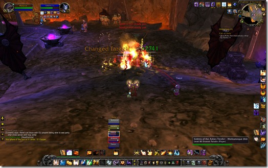
Now we’ve got some more action going on here. The healing combat text hasn’t changed much. My personal Renews appear on the bottom right. Haven’t shielded anyone yet.
If you look carefully at our tank, you can see a Frostbolt icon on the bottom left. I almost missed it. Things like debuffs that can be removed need to be made a lot more noticeable.
Green bar shows approximate incoming heal amount. I don’t know if that’s before or after any type of Mortal Strike debuffs or healing buffs.
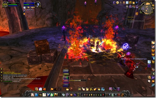
That’s it for shots since I’m too busy trying to keep the group alive (Prayer of Healing was the next spell cast, believe me).
Then we wipe because I cast Guardian Spirit on the wrong Pally when some Ogres and stuff wander into us.
EDIT – Back in. Here’s more:
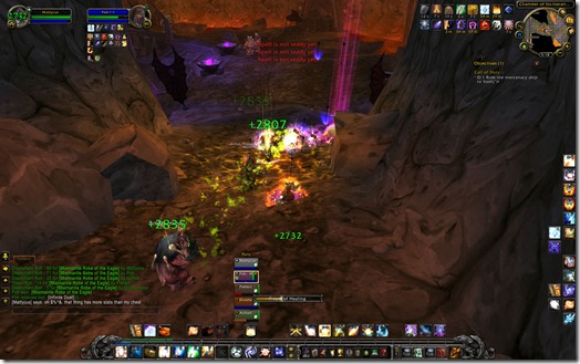
Something that needs to improve on is the dispelling interface. It’s really hard to notice. You have to mouse over it in order to see what type of debuff it is. In the shot below, you can see a little red skull icon on the top right denoting a disease. The actual disease icon is then on the bottom left where you can mouse over and see what it actually is.
I think a better solution would be to fill the entire player frame with the appropriate dispel color which states what type of debuff it is.
For example, if I get hit with a Frostbolt, my background color could fill with a gradient blue which overrides my normal class color of white. That would make it extremely obvious I have a debuff. The actual debuff icon could still be on the bottom left.
Definitely very cool though.
Thoughts? If this continues to get developed and streamlined further, I might not have to use custom raid frames anymore.
I had no idea they were making a healing UI! I love this. I agree with your critique, though; it would be nice to see what kind of debuff is on a player without having to mouse over their frame. I personally hate having to install addons like X-Perl or Grid or whatever to make healing less of a pain, so this interface looks like a nice in-between step. Thanks for the review. 🙂
I’ve read about this, but haven’t seen any pictures yet… You’re telling me that the default UI looks and works like Grid which I’m used to using? And it’s actually usable?
Awesome.
Btw, how configurable this is? What if you’d have more hots, like a druid?
Saithir: I don’t knock about click casting. My style of healing involves selecting the target and then pressing the corresponding keystroke. For the Mouseover Macro users, that might need to be redone again or at least slightly reconfigured.
Yes, its definitely usable. I can come back after a disconnect with a fried UI and still heal.
I don’t know how Druids would operate. I surmise that there’d be a little number on the icon that shows how many stacks there are. But as I don’t have any spells that can emulate that, I wouldn’t know.
This looks absolutely awesome! I use Grid + Clique for healing, but at the moment have a very low quality computer. The less addons I use, the happier my computer is, so integrating this nice healing UI really helps!
Wow, that looks incredible. Actually, it’s extremely similar to the way I currently have Vuhdo set up, as far as size, icon placement, text… I could work with that, but I would really not want to give up my click casting. It’s fine for a limited period… like say after a patch or if I (please please Blizzard) got in the beta, but I wouldn’t like manually targeting permanently.
Well, I will always use addons. I think it’s my personality, if Blizzard puts it this way I must put it a different way. Lol! Oh well. All I can say about the new healing UI is that I am very happy with it – no longer will I have to feel like ANY and EVERY healer needs to download a unit frame addon to do their job to the best of their ability, which for many who unlike me dislike addons, I am sure is a huge and welcomed relief. This was a long time coming since the current raid frames leave a LOT to be desired. These new ones actually look kinda spiffy.
Very cool. Now here’s hoping Cataclysm will also introduce native Tauntmaster-esque functionality!!
Amazing! I had all but given up hope for Blizzard implementing useful raid frames, though I agree with Poptart that I will most likely continue to use an addon to replace them.
Blizzards implementation of addons has generally been pretty clunky in my opinion (Threat meters, outfitter) so even though your screenshots look great I’ll remain skeptical until I can play around with it.
It really looks so much better than the neigh invisible lines that are so far apart on the current version though, cheers for that. ^^
Finally! I knew you would be the first one of the bloggers out of the gate with information I’m interested in. Thanks for living up to your reputation, Matt. You rock!
Now it’s time to wait for Derevka and Avalonna to get off their arses and post something Priesty. 🙂
Im sitting here pinching myself. I totally agree with your comments on the UI but then again the frames as they in this preview is something that healers have been asking for really since the start of wow. Ok so it only took 5 years to get them but WOOT anyway
With these updates, what I’m sure we’ll see happen are very lightweight versions of our current mods. Mods like VuhDo, Grid, etc could use the bones of what Blizzard has given and just perfect the things like debuff coloring, sizeability, etc. I’m all for less lag from addon usage, and I’ve been praying Blizz would implement UI features for healers.
Did you set up a focus at all with the raid frames? I’m wondering if the focus frame would mimic the player frame or the raid frames. Also, can the raid frames show pets? I saw that Bibi had some code up that looked like it would allow for that, but I don’t see one for the hunter in your group in the shots above.
Now all they need is an interface option somewhere that says “Use mouseover targetting for party/raid frames” and mouseover+keybind will work without having to replace every action bar button with a mouseover macro.
This is nice, but like most of Blizzards UI implementations of third party addons I’ve seen, it would probably be too little, too late. It will lack any real customizability and be a little clunky compared to dedicated third party addons that have been refined for years.
So, the real thing this makes me wonder about is whether Blizzard made any new infrastructure for this and if/how that might improve Grid (and others) in the future.
“For the Mouseover Macro users, that might need to be redone again or at least slightly reconfigured”
I don’t think that’s needed. I healed a bit on my priest as well and just copy-pasted a bunch of mouse over macros from some random forum post and they worked just fine.
I agree with the dispellable stuff not being quite clear but other than that they are pretty close to perfect.
Wow this is awesome! Is it possible to increase the size of the default raid frames? That might solve the debuff thing.
I really like that they’re implementing things into the default UI that previously you’d have to rely on addons to do. Especially the aggro indicator, it’s pretty vital for tanking as well.
I’m also interested how customizable those new frames are. It would be nice if someone uploads screenshot with the configuration menu, just to get a notion.
Holy crap, it’s like they copied a screenshot of my grid! Color me impressed. ^^
lol @ you DEing a green upgrade!