Mayron UI is a fully fledged interface compilation for DPS, tanks, and healers. You can grab the whole package on WoW Interface. It centers around Grid and ShadowedUnitFrames.
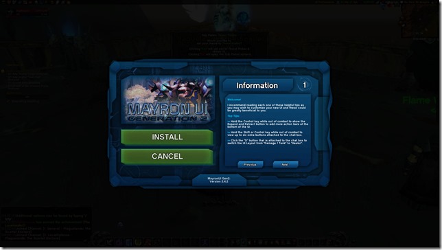
I chose the MayronUI because of the way it looks. Everything is centralized. It allows me to easily switch modes between Shadow and healing at anytime. It even has it’s own custom installer. Mayron UI is really easy to install. The instructions involve you extracting the addons into your addons folder. There’s another set of files that you have to load within your WTF folder as well. Once you fire it up in game, you’ll get an installation screen. Veterans that are already familiar with custom UIs will have an easier time with it. Newer players just getting started with custom UI elements need not worry as the instructions are detailed enough.
As for memory usage, it comes in at around 40MB+ for me (but will spike upwards to about 60ish due to Recount).
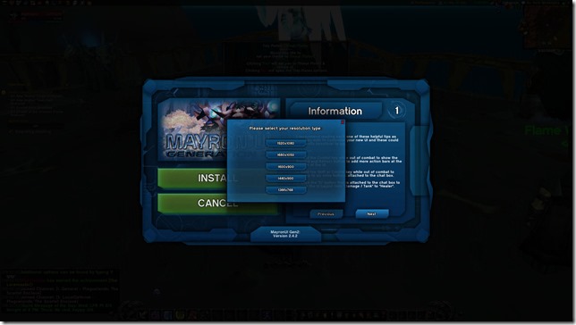
It’s built for widescreen resolutions (1920 x 1080, 1680 x 1050, 1600 x 900, 1440 x 900, and 1366 x 768). You need to play at full screen out of the box. I typically play in windowed mode and sometimes there’s a slight disruption on the bottom right with Recount (see third image below) but that can be solved by simply unlocking and moving it over slightly.
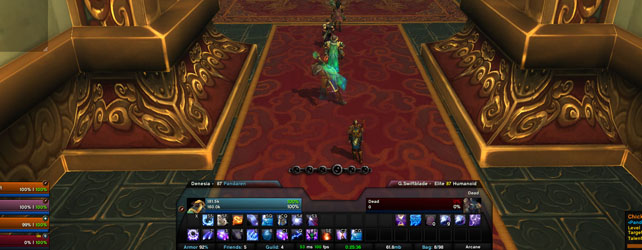
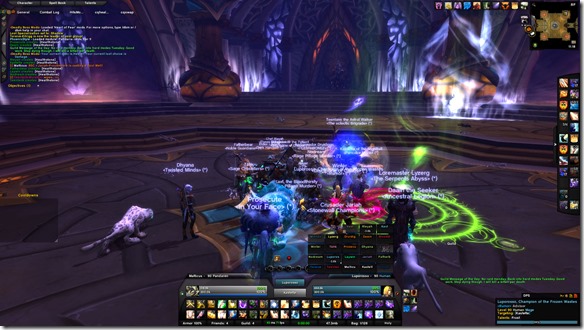
5 man view
Not much really changes between healing and DPS mode. The above screenshot shows what it looks like when I’m healing. Frames are nice and centralized and they go horizontal. Those three circles in the middle are a different addon (NugComboBar for Archangel stacks or Shadow Orbs). Buff and debuff tracking on you appear in the top right next to your map. Action bars can be shown or hidden based on your needs. There’s some nifty tabs in the top left that allow you to access various panes (Spellbook, character stuff, etc). There’s a convenient area in the top left where the chatbox can go. I added another chat pane to mine and placed it on the bottom right to help filter and sort through the various channels.
Healer mode
This is what the healer side of things looks like. The Grid raid frames are slightly off center. It might take some getting used to for players though as the bottom row is considered group 1 while the top row is group 5. I know many players prefer columns instead of rows for their groups. It continues to stretch upwards in order to accommodate 40 man raid groups. Your target’s buffs and debuffs appear just to the side of the action bars below. Raid debuffs continue to appear on Grid itself and you can customize and add certain ones as needed. Your peripheral vision will come in handy in case any offensive dispels need to be cast.
There’s a slight catch with the healing frames. The focus frame is the larger frame on the right. The target frame is the smaller one in the middle. You can keep the tank focused while healing other players in the raid. Let’s be real here, I don’t think many of us actually look at the target frame when we’re raid healing anyway. We can eyeball health bars and percentages off our raid frames fairly easily. Having that focus frame in such a prominent area is handy because it becomes plainly obvious if our tank is afflicted by something or has suffered a large amount of damage coming in.
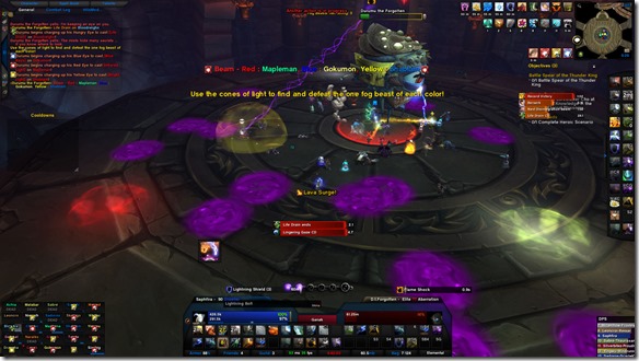
DPS mode
Switching between modes is simple. There’s a little button on the left side of the chat box that lets you toggle your views.
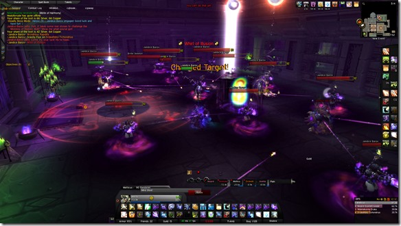
This is what DPS mode looks like. Raid frames are in the bottom left. Unlike healer mode, your target of target appears in the middle between your unit frame and your target unit frame. I don’t have anyone focused but they would appear just above them. Like healer mode, notable buffs and debuffs for your target appear just to the right side of your bottom action bars. One of my concerns as a Shadow Priest is ensuring that all my DoTs stay up. Tidy Plates helps with that here as there’s no other addon that lets me track multiple DoTs on multiple targets (ClassTimer is included and helps with timers from target to target but doesn’t do well with multiple targets like Council f ights). Activate nameplates and track them manually.
All in all, Mayron’s is certainly a clean UI to work with as a base. I customized mine slightly by adding other raid related addons like TellMeWhen to alert me when certain abilities were available.
Configuration
There’s no “master” window to configure addons from. It would’ve been nice to have a central panel but it’s easy enough to access the options you need to get to anyway.
/install – Opens up the Mayron Setup Window
/bonus – Opens up the Bonus Features Window
/rl – Reloads the UI
/ltp – This opens up Leatrix Plus which contains very useful general settings. Worth looking through.
/suf – Settings for the Unit Frames (Shadowed Unit Frames)
/bar – Bartender Settings (Action Bars)
/kgpanels config – Settings for all the graphical art panels being used – Can become very technical.
/classtimer – Settings for the timers on the top of the palyer and target frame – You can remove and add additional timers through this.
/align – Places a Grid over the screen so that you can align UI elements easily.
Full list of addons
- ACP
- BankStack
- Bartender4
- Broker + Plugins
- ButtonFacade + Masque
- Chatter
- ClassTimer
- ColorPickerPlus
- Bazooka
- Doom_CooldownPulse
- DragEmAll
- eAlign
- ErrorMonster
- Grid
- ImprovedOptionsFrames
- kgPanels
- Leatrix_Plus
- nibChatTabs
- OmniCC
- Parrot
- Postal
- Quartz
- Recount
- Reflux
- ShadowedUnitFrames
- SLDataText
- Simple Power Bar
- TipTac
- Tidy Plates
- Who Framed Watcher Wabbit
- XLoot
- XLootGroup
Notes:
You need to get your own boss mods. It won’t come with DBM or BigWigs. Pick the one you like. In addition, certain classes may want to pick up additional class specific addons. All in all, I think it’ll help provide many solutions for players looking for a clean UI that’s universal across multiple characters and roles.
It’s the first post I’ve done in a while that looks specifically at compilations. Leave any questions below, and I’ll answer them as best I can (and incorporate them in future UI compilation review posts and notes).
buy zelnorm online
Synthroid no prescription
http://buywithoutprescriptionrxonline.com/premarin.html
Hey Matt,
Going to play around with this and see if i can tweak it to my needs. It looks like a good base to start with.
Looks good, but I already use ElvUI, and I’m a bit leery of installing a new “master addon”. I may try to download a second version of wow, or install it on my wife’s laptop and test this out, but I don’t want to do anything that could jeopardize my current set up.
Thanks for the info, though. Can’t wait to at least give it a look.
Darthkeller Just make a backup folder. copy your interface/font/wtf folders to it. Install this UI. play with it. delete the Interface/font/wtf folders. copy the folders from your backup. easy peasy old setup back without a hitch
Epicwood Darthkeller I’m sorry, Epic, but that sounds too easy, and thus, must be rejected! SHUN THE EASY! SHUN!
(Right now I’m somewhat kicking myself for not thinking of that…. Thank you. I’ll take a look at this later tonight.)
Hey Matticus,
Giving this a try, not used to pre-built UIs. I am familiar with bartender but how did you get the 2nd row of action bars below your / targets health bars.
These will show if i untick the always hide option for bars 9 and 10 in bartender menus, but then they are hidden under the health bars. Any advice would be fantastic.
@Tela Hold down CTRL. and expan button will show up above the first action bar
Epicwood bah always so simple, thanks alot!
Epicwood Did a couple of challenge modes with this, noticed that the graphic that shows up when you get e.g. sticky residue in Siege to show how much you need to jump doesn’t appear. This would be the same graphic shown on say Stone Guard MSV and is pretty useful information.
Any idea where the options for that are hidden?
Have you had any luck updating this without redoing all of your settings??